Challenge
When the QFR® 3.0 project was first presented to me
When the QFR® 3.0 project was first presented to me, the challenge was clear: the technology was already incredibly advanced, but the interface didn’t feel that way. Behind the product were super intelligent algorithms designed to help clinicians assess coronary artery physiology, yet the existing UI felt old and overwhelming. My role was to bring the GUI experience up to the level of the technology: to make QFR feel modern, intuitive and confident without losing the depth of information clinicians rely on.
I started by looking at the complete workflow rather than individual screens.
Designing around the decision
- Where were users spending time?
- Where was information difficult to interpret?
- Which actions could be automated?
- And, most importantly, what information does the clinician need to understand first?
This research shaped the product around a simple principle: The interface should make the clinical answer easier to reach, not make the user work harder to find it.
From QFR 2.2 → QFR 3.0
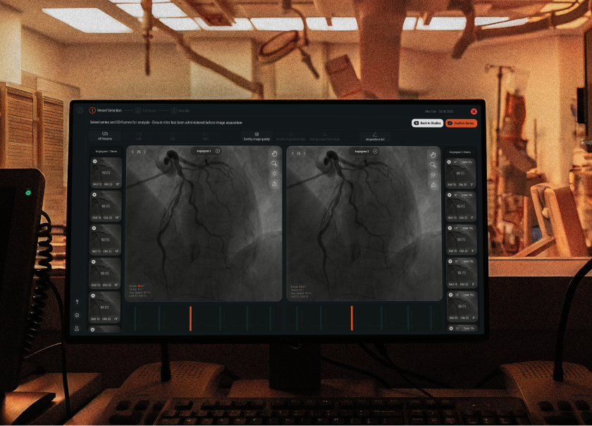
The redesign was an opportunity to shift the product from a more interaction-heavy experience towards a more automated and focused workflow. Automation took care of more of the process, while the interface became more intentional about what it presented and when. Instead of exposing everything at once, we created a clearer hierarchy between the analysis, supporting information, controls, and final result. The goal was simple: Less interaction. Less visual noise. More focus on the result.
Designed for the cath lab
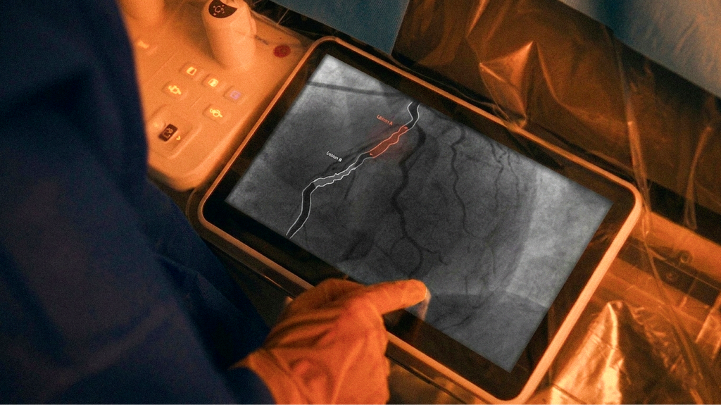
The cath lab became an important context for every design decision.
Users need to work quickly, often while dealing with complex clinical information and limited attention for navigating software. That led to a design philosophy of: Less UI. More signal. The interface needed to be readable, focused, and predictable, with the most relevant information visible without unnecessary navigation. The under-three-minute workflow became a practical design constraint throughout the project.
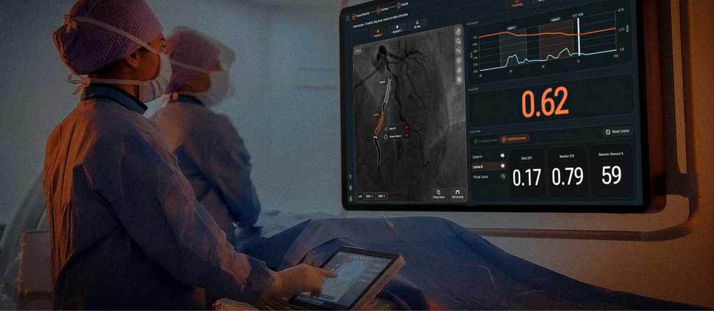
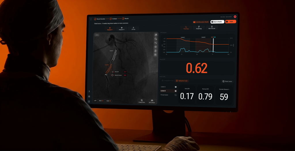
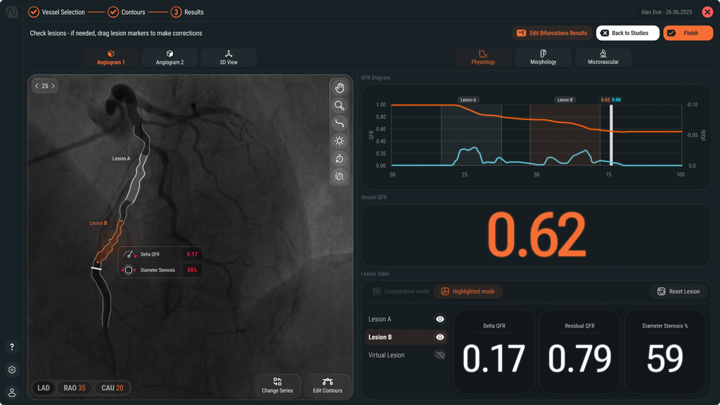
One of the most important design decisions was giving the QFR value a much stronger visual presence.
The QFR result is the key output of the workflow, so it needed to be immediately visible and readable at a glance. Rather than making users search through the interface, the redesign puts the result at the center of the experience. Big. Clear. Immediate. The surrounding interface supports the result instead of competing with it.
Making graphs easier to read
Graphs are an essential part of understanding the analysis, but complex visualisations can quickly become difficult to interpret. I worked on the visual hierarchy and presentation of the graphs to make the important information easier to scan and understand. The aim wasn’t simply to make the graphs look cleaner. It was to make them more useful under time pressure. Every visual decision, from typography and spacing to labels and emphasis, was considered in relation to how quickly a user could understand what they were seeing.
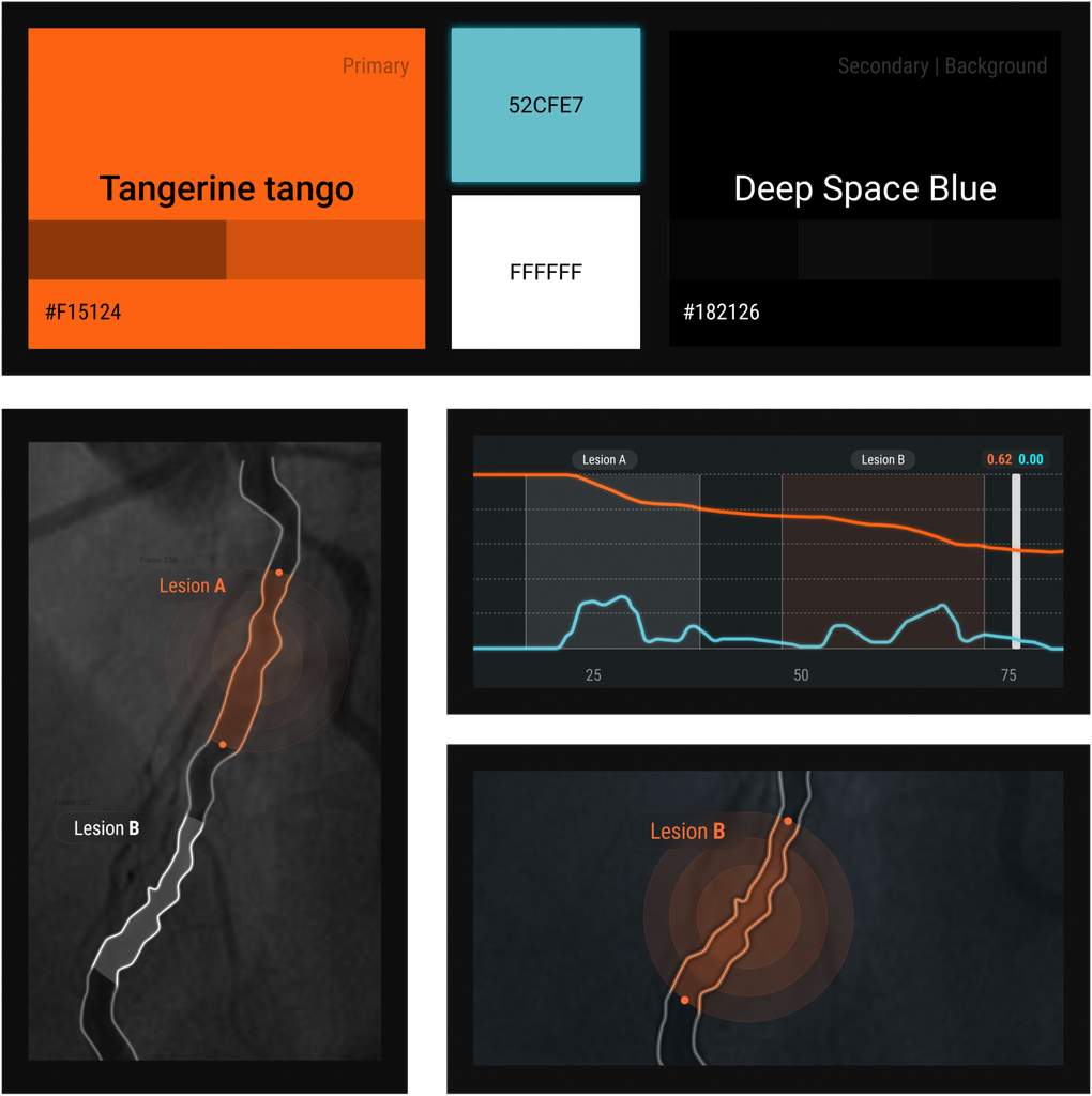
As a UX Researcher, UX Designer, and Usability Engineer, I worked across the full user-centered development process, connecting research, workflow analysis, interaction design, and usability evaluation. The process was iterative—Research → Design → Evaluate → Refine—with user insights continuously shaping the experience. As a regulated medical-device product, Medis QFR also required usability to be integrated into the development process supporting FDA and CE requirements, ensuring design decisions were grounded in both user needs and usability evidence.

The transition from QFR 2.2 to 3.0 focused on creating a more modern, automated, and focused experience for the cath lab. We simplified the workflow, made the QFR value and graphs easier to read, and designed the experience around a less-than-three-minute workflow. Every detail was revamped, from icons and fonts to layouts, spacing, and individual pixels. The result was a clearer path from analysis to clinical insight, with less manual interaction and greater focus on the information that matters most.